As before, we have a qplot of a time series of prices. We want to get quantiles of the time series and add ablines at those values. We have a price vector called “price” and are interested in its 25th, 50th, and 75th percentiles.
> quantile(price,c(.25,.50,.75))
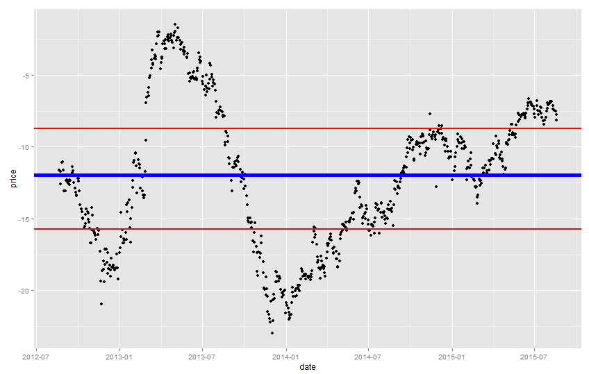
25% 50% 75%
-15.73075 -11.94800 -8.73450
The 50th percentile is called the median, and we also want to see the mean:
> mean(price)
[1] -12.0265
The median is greater than the mean, meaning that the price series’ distribution is skewed to the left (more points toward the right but more extreme values to the left).
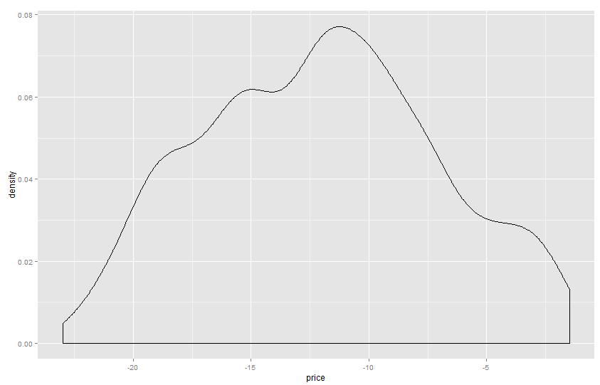
We can see that by plotting the density function of “price”:
> qplot(price,geom="density")
which gives us this graph, which is slightly skewed to the left:
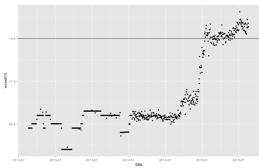
Again, we create the qplot like this:
> m = qplot(date,price)
Then we add the ablines at the 25th, 75th, and 50th percentiles, using “lwd” and “col” to customize them:
> m + geom_abline(intercept = -11.95, slope = 0,lwd = 2, col="blue") + geom_abline(intercept = -15.73, slope = 0,lwd=1) + geom_abline(intercept = -8.73,slope = 0,lwd=1)
Which returns this graph:
Update:
For a more efficient code, embed the statistics in the abline:
> m + geom_abline(intercept = mean(price), slope = 0,lwd = 2, col="blue") + geom_abline(intercept = quantile(price,.25), slope = 0,lwd=1,col="red") + geom_abline(intercept = quantile(price,.75),slope = 0,lwd=1, col="red")