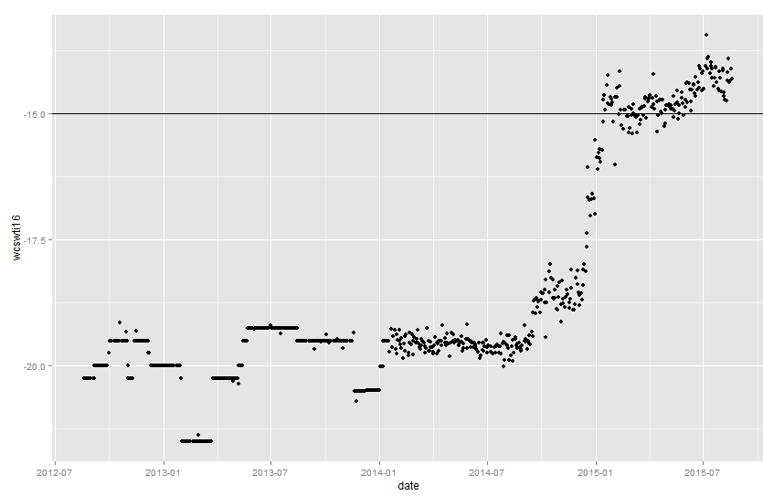
You want to graph a time series of prices using qplot in the ggplot2 program.
First create the date and price vectors. The price vector will be the spread between two separate prices:
> date = data$date
> wcswti16 = data$wcs16 - data$wti16
Call the qplot, with the date vector as the x-axis and the spread as the y axis, “p”. Then add an abline to p at the y-axis point of your choice:
> p = qplot(date,wcswti16)
> p + geom_abline(intercept = -15, slope = 0)
This is the result: