Category Archives: R

How to Create a Correlation of Multiple Time Series in R

With a matrix of data like this (you should calculate correlations on returns, but absolute prices are used here for the example):

excelpic

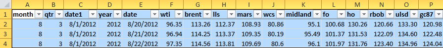
Name your desired column vectors:

> wti = data$wti
> brent = data$brent
> lls = data$lls
> mars = data$mars


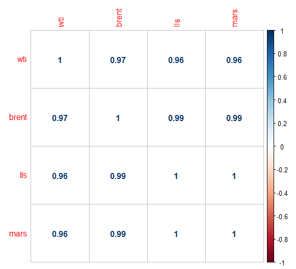
> dataframe = data.frame(wti,brent,lls,mars)
> COR = cor(dataframe)
> head(round(COR,2))
       wti brent  lls mars
wti   1.00  0.97 0.96 0.96
brent 0.97  1.00 0.99 0.99
lls   0.96  0.99 1.00 1.00
mars  0.96  0.99 1.00 1.00


If the correlation matrix comes back with “NA”s, use the na.omit command:

> clean = na.omit(dfrm)
> cor(clean)


Load “corrplot” package:

> library(corrplot)


> corrplot(COR,method = "number")


corrplot

See here for more on corrplot:

https://cran.r-project.org/web/packages/corrplot/vignettes/corrplot-intro.html

The R Cookbook has good information.

How to Subset a Vector by Another Vector in R

You have a matrix like this:

excelpic

You want to only look at Q1 prices for the spread between two products.  You can subset the price vectors by the qtr vector like this:

gcq116 = data[data$qtr==1,c("gc87q116")]
rbobq116 = data[data$qtr==1,c("rbobq116")]


Create the date vector:

> dateqtr1 = data[data$qtr==1,c("date")]


You now have two price vectors showing only the Q1 prices.  Graph the spread between the two vectors like this:

> qplot(dateqtr1,gcq116 - rbobq116)


which returns this:

subset prices

Adding Multiple ablines of Different Weights and Colors to Describe Statistics of a Time Series in R

As before, we have a qplot of a time series of prices.  We want to get quantiles of the time series and add ablines at those values.  We have a price vector called “price” and are interested in its 25th, 50th, and 75th percentiles.

> quantile(price,c(.25,.50,.75))
      25%       50%       75% 
-15.73075 -11.94800  -8.73450


The 50th percentile is called the median, and we also want to see the mean:


> mean(price)
[1] -12.0265


The median is greater than the mean, meaning that the price series’ distribution is skewed to the left (more points toward the right but more extreme values to the left).

We can see that by plotting the density function of “price”:

> qplot(price,geom="density")


which gives us this graph, which is slightly skewed to the left:

price density

Again, we create the qplot like this:

> m = qplot(date,price)


Then we add the ablines at the 25th, 75th, and 50th percentiles, using “lwd” and “col” to customize them:

> m + geom_abline(intercept = -11.95, slope = 0,lwd = 2, col="blue") + geom_abline(intercept = -15.73, slope = 0,lwd=1) + geom_abline(intercept = -8.73,slope = 0,lwd=1)


Which returns this graph:

time series abline

Update:

For a more efficient code, embed the statistics in the abline:

> m + geom_abline(intercept = mean(price), slope = 0,lwd = 2, col="blue") + geom_abline(intercept = quantile(price,.25), slope = 0,lwd=1,col="red") + geom_abline(intercept = quantile(price,.75),slope = 0,lwd=1, col="red")


Facets on a QPlot Time Series

How do you break the previous chart into yearly charts with the same abline?  You use facets.

This is why you should have month, quarter, and year columns in your daily price matrix.

Using the same line of code as before, add the facets command:

> p = qplot(date,wcswti16,facets = .~year)
> p + geom_abline(intercept = -15, slope = 0)


Get this:

wcswti16 facets

Time Series with QPlot with a Horizontal Line in R

You want to graph a time series of prices using qplot in the ggplot2 program.

First create the date and price vectors.  The price vector will be the spread between two separate prices:

> date = data$date
> wcswti16 = data$wcs16 - data$wti16


Call the qplot, with the date vector as the x-axis and the spread as the y axis, “p”.  Then add an abline to p at the y-axis point of your choice:

> p = qplot(date,wcswti16)
> p + geom_abline(intercept = -15, slope = 0)


This is the result:

wcswti16

Creating Charts in R

I’ve been moving all of my energy trading analysis from Excel to R.  Excel has a low entry cost, in terms of learning curve, and is used everywhere, so most people stay with it.  A program like R, however, is vastly more powerful and useful for anything but the most basic analysis.  The difficult part is getting over the steep (relative to Excel) learning curve before giving up and falling back to Excel.

Most people in energy trading have a spreadsheet with a matrix of prices and other data like this.  You should have columns for month, quarter, year, etc. for faceting R graphs.  More about that later:

excelpic

After downloading R and RStudio (both free), get the xlsx package, which allows you to upload Excel files into R, by typing this in:

> library(xlsx)

Upload the Excel price matrix into R from wherever your spreadsheet is saved.  sheetName is the name of the tab you want in the workbook:

> data = read.xlsx(“c:/R/correlations.xlsx”,sheetName = “bbls”)                     

Get the ggplot2 graphics package from R.  This offers much better graphics and ease of use than the base R graphics system:

> library(ggplot2)

Write this code in R to name your date, WTI crude price, and Brent crude price vectors:

> date = data$date


> wti = data$wti
> brent = data$brent


Then type this.  Qplot stands for quick plot and is the base graph in ggplot2:

> qplot(date,wti,geom="line")


You get this chart:

qplot2

After this brief setup it is already easier than charting in Excel.

Update:

To change line color and line weight, add these commands:

> qplot(date,wti,geom = "line",color = I("red"),size = I(1))


Giving:

qplot line